How to Choose Fonts That Match Your Wedding Style
Your wedding invitation is more than a card—it’s the first glimpse your guests get of your celebration. And one of the most powerful design elements that shapes that first impression? Fonts.
Fonts set the tone, express your style, and can transform even the simplest design into something that feels just right. But with so many typefaces out there, how do you choose the ones that match your wedding vision?
Let’s break it down.
Why Fonts Matter in Wedding Invitations
Just like color and layout, fonts help communicate the mood of your wedding. Think of typography as your invitation’s “tone of voice”—elegant, modern, romantic, playful, traditional, or somewhere in between. The right font combination can elevate your suite and give your guests an instant sense of what to expect.
Tips for Choosing the Right Fonts for Your Wedding Style
1. Consider Your Overall Wedding Aesthetic
Your fonts should feel like an extension of your wedding’s look and feel. Ask yourself:
Is your wedding modern or classic?
Romantic or minimalist?
Rustic or formal?
For example:
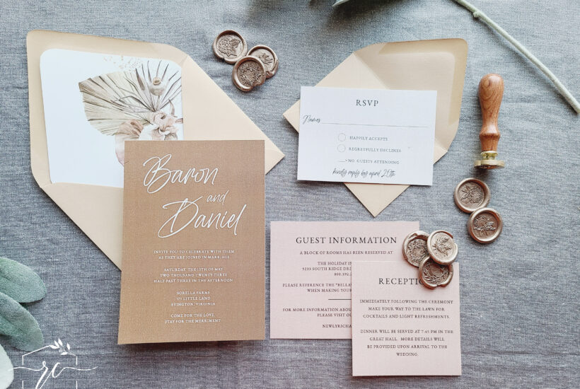
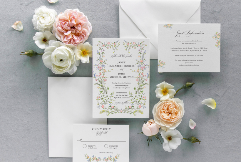
Romantic weddings pair beautifully with flowing script or calligraphy fonts.
Modern weddings often favor sleek sans-serifs with clean lines.
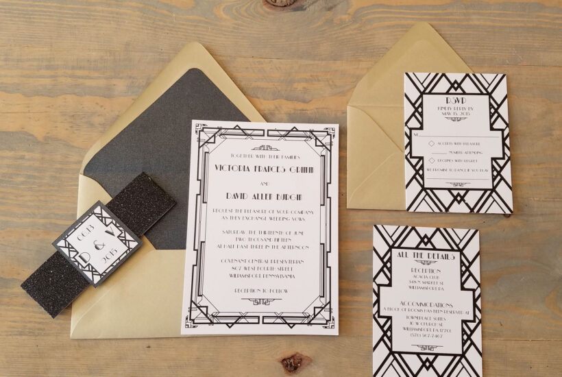
Rustic weddings work well with hand-lettered or textured serif fonts.
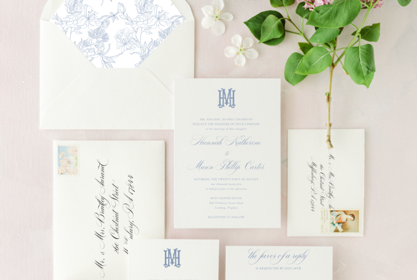
Classic weddings shine with traditional serif fonts paired with elegant calligraphy.
2. Pair Fonts Thoughtfully
A wedding suite usually includes two or three fonts—often a primary, a secondary, and a supporting typeface. When pairing fonts:
Combine contrast and harmony.
Use one decorative font (like a script) and one simpler font (like a serif or sans-serif).
Make sure the fonts don’t compete for attention.
Pro Tip: Keep readability in mind, especially for important details like the date, time, and location.
3. Reflect Your Personal Style
Your invitations should feel like you. If you’re drawn to more romantic, whimsical designs, don’t be afraid to lean into flourishes and curves. If you’re more minimalist or modern, opt for simplicity and clean lines.
At Raspberry Creative, we’ll guide you through font selection based on your preferences, wedding style, and even your venue.
Font Inspiration by Wedding Style
Here are a few font pairings we love for different wedding aesthetics:
Romantic & Whimsical:
Script: Adelicia Script, Bickham
Supporting: Baskerville, Didot
Modern & Chic:
Main: Futura, Avenir
Accent: sleek calligraphy or minimalist script
Rustic or Outdoor:
Main: Georgia, Playfair
Accent: hand-lettered or textured fonts like Northwell or Wildflower
Classic & Timeless:
Main: Garamond, Caslon
Accent: Copperplate or a delicate script
Need Help Choosing Fonts? That’s What We’re Here For.
At Raspberry Creative, font selection is never an afterthought. We carefully consider your wedding aesthetic, season, and personal style to recommend typefaces that tell your story beautifully.
Ready to design your perfect suite?
Start with one of our semi-custom designs or reach out to create something custom just for you.
👉 Explore our invitation suites or get in touch with us here!

Customer Service: M-F 9-5 EST
Closed weekends & holidays
We are not currently scheduling
in-person appointments.
