How to Choose the Perfect Wedding Invitation Color Scheme
Your wedding invitations are your guests’ first peek into your big day, and one of the most impactful design choices you’ll make is your color scheme. The colors you choose will set the tone, reflect your personal style, and create a cohesive look that carries through to your ceremony and celebration.
But with so many colors and combinations to choose from, where do you begin? Here’s your step-by-step guide to choosing the perfect wedding invitation color scheme.

Let Your Wedding Season Inspire You
Each season offers a natural color palette:
Spring: Soft pastels, sage green, blush pink, dusty lavender
Summer: Bright corals, warm yellow, bold blue, tropical greens
Fall: Deep burgundy, rust, amber, mustard, terracotta
Winter: Emerald, navy, icy blue, metallics like gold or silver
Starting with your wedding season helps narrow down the options and ensures your invitation aligns with the mood of the time of year.

Consider Your Venue and Decor
Are you getting married in a romantic garden, a rustic barn, or a formal ballroom? The style and location of your venue can help guide your color decisions. If you’re using specific colors in your floral arrangements or tablescapes, incorporating those into your invitations creates a beautifully cohesive experience.

Think About Your Wedding Theme or Style
Your invitation should be a reflection of your overall wedding style:
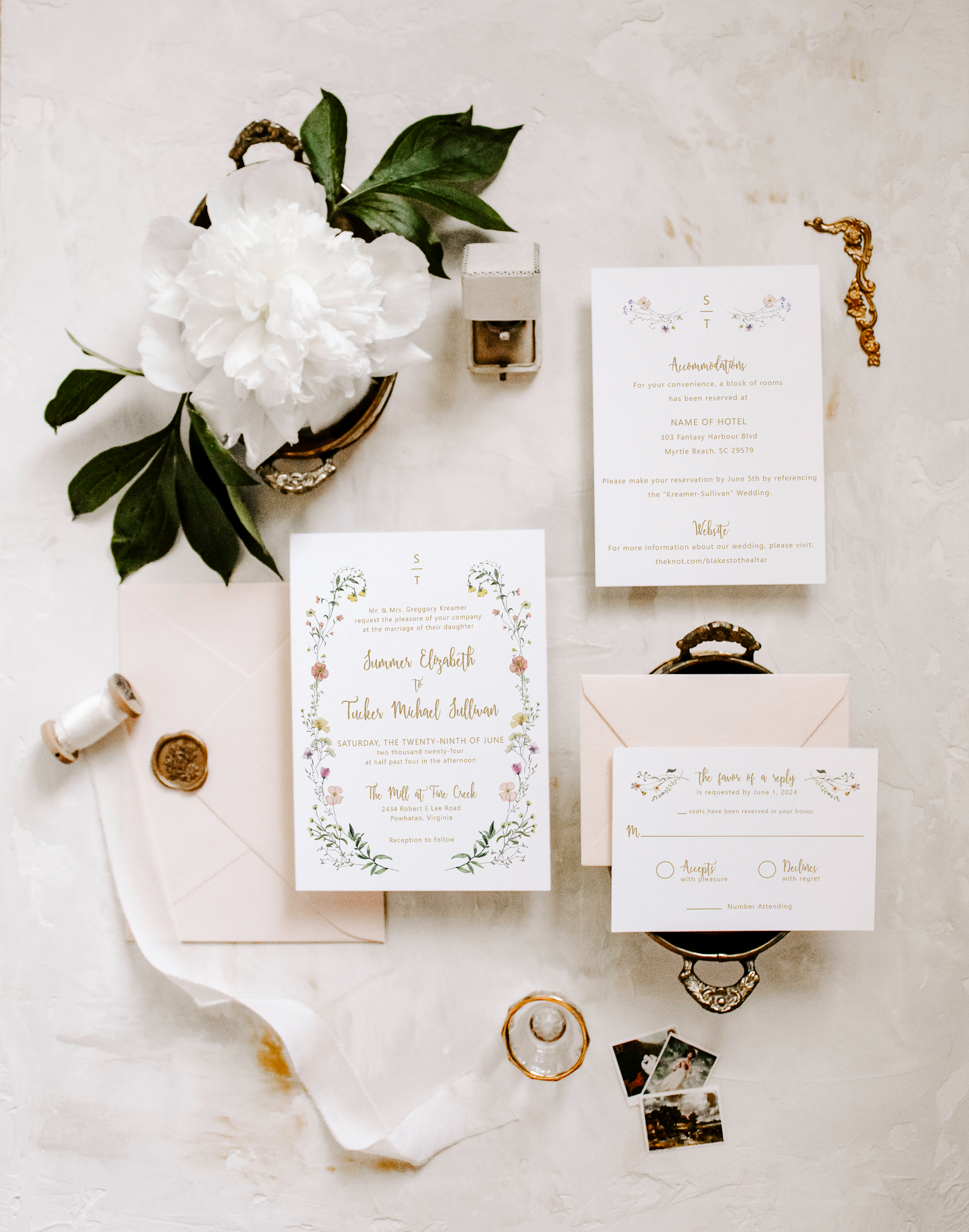
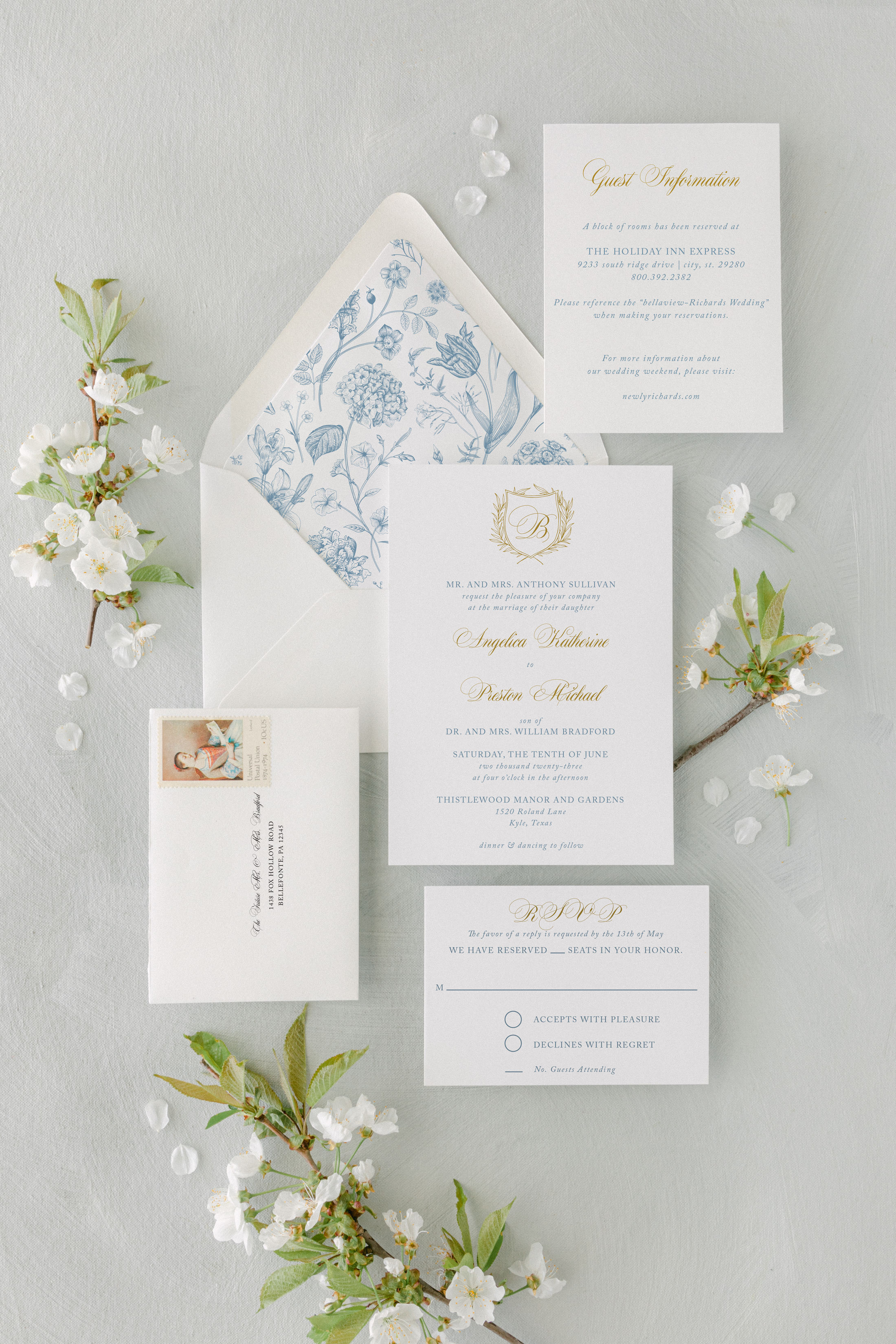
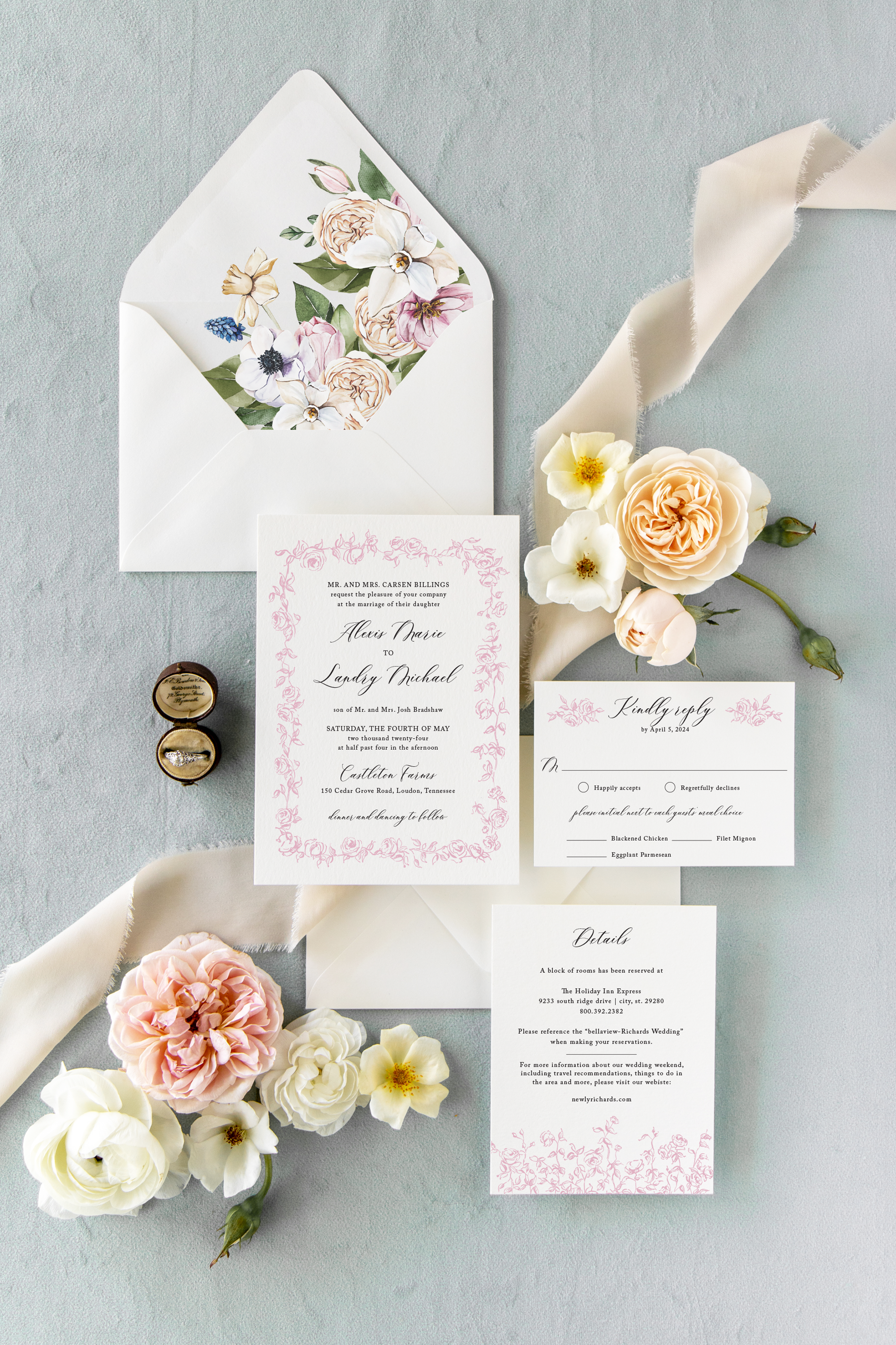
Romantic & Vintage: Blush, dusty blue, cream, soft metallics
Modern & Minimalist: Neutrals, monochrome, clean lines
Bold & Dramatic: Jewel tones, contrasting color pairs, black & gold
Boho & Earthy: Terracotta, rust, ochre, olive green

Choose a Primary and Secondary Color
A well-balanced invitation often includes:
One primary color that dominates
One or two secondary colors for accents or text
A neutral (like ivory, gray, or taupe) to keep it from feeling overwhelming

Match or Complement Your Envelope & Liners
Your envelopes and envelope liners can either blend seamlessly or provide a pop of contrast. Don’t forget to factor them into your overall palette! A classic neutral invitation with a rich floral liner can add that “wow” factor without being overpowering.
Ask for a Color Swatch or Sample
If you’re not sure how your colors will translate to paper, ask your stationer (like us!) for samples. We’re always happy to send swatches or mockups to help you visualize how it all comes together.

Final Thoughts
Choosing your wedding invitation color scheme doesn’t have to be overwhelming. Start with inspiration from your wedding season and venue, narrow in on your style, and don’t be afraid to mix neutrals with bold or romantic accents.
Still unsure? We’re here to help! Whether you’re customizing one of our existing designs or starting from scratch, we’ll guide you every step of the way.
💌 Ready to bring your vision to life? Browse our invitation collections or reach out for a custom design consultation.

Customer Service: M-F 9-5 EST
Closed weekends & holidays
We are not currently scheduling
in-person appointments.
