September marks the 18th year that I’ve been in business. While the name “Raspberry Creative” came a few years later, the business has existed for almost 20 years! I have grown up with this business and like I have seen different phases in my own life, the business has also gone through phases.
Today marks the official re-introduction of Raspberry Creative in its newest form and I’m so excited to share the details with you! Truth be told, it’s been a couple of years in the making and even though I didn’t realize it in the early stages of this transition, it really has been the result of me digging deep into myself to get where I am today.
I will be touching on several different aspects of this new brand but today I really just wanted to start with the WHY behind this rebrand.
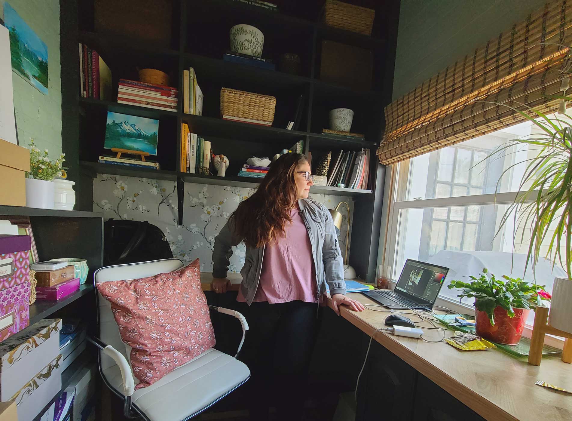
If you’ve followed me since the early 2010s (THANK YOU) then you’ve heard me talk a lot about always wanting to improve my client experience. I’ve always (from a child) been passionate about design and pretty paper and when I decided to take my business in the direction of wedding stationery from small business branding, I knew I had found my place. It was that transition that made me really start thinking about the experience of my clients and how I serve them because I knew how I had felt going through the same thing..
As years passed, I, with a small team of employees, developed a process for our clients from initial inquiry through final deliverables. Through a lot of trial and error and perfecting this process became second nature and my clients often have told me over the years that they really enjoyed their experience when they actually didn’t look forward to the stationery part of their wedding planning.
When my unofficial business partner left the company to pursue her own path, a lot changed all at once and ushered in a new phase of the business. In the years that followed, I transitioned away from one-on-one custom projects as my core service to more of a retail model.
Without realizing it because of the busy day-to-day, I had lost my joy because I was no longer helping people but simply pushing out orders without really knowing if the customers had need for more help. It was no longer personal and special, it was more like copy-paste-repeat and I slowly became bitter and even considered stepping away for good.
Then came the COVID pandemic and like so many other businesses, things nearly came to a halt. I was no longer joyful and with weddings on hold indefinitely, I once again considered finally calling it quits yet something inside me said to keep pushing…and so I did.
It was during this time that the seeds were planted for this new brand experience. The Pandemic made so many of us slow down and reevaluate our priorities. I realized at that time that if I don’t have joy in my work then I can’t bring joy to my clients either.
What I have always loved about my work (aside from the design itself) is helping couples navigate their wedding stationery through the experience and knowledge that I have. I find joy in serving my clients and making their wedding planning stress-free and fun. I’ll share all about the client experience in a future post but until then know that it’s getting back to serving my clients as a personal guide is the WHY behind the new brand.
The New Look
A brand is much more than a logo. A brand is made up in part of your logo, your business identity, but it is also very much about how your clients and community perceives you and your business through how you serve them. Things includes communicating on social media, your website, your emails and interactions directly with them, your products… Every piece of your business adds up to your brand and how the outside world views your business. That, my friends, is a brand.
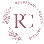
So with that said, Raspberry Creative hasn’t necessarily been rebranded numerous times over the past 18 years but it has seen a number of logo versions. As someone who was originally a logo and brand designer for small businesses, I’ve always taken on my own design work for the business. It’s always 100x harder designing for myself but this time I’ve finally reached my logo goals.
Several times in the past I have attempted a logo icon using the letters “RC” and I’ve never quite accomplished the right blend of simple, classic and elegant…until now.
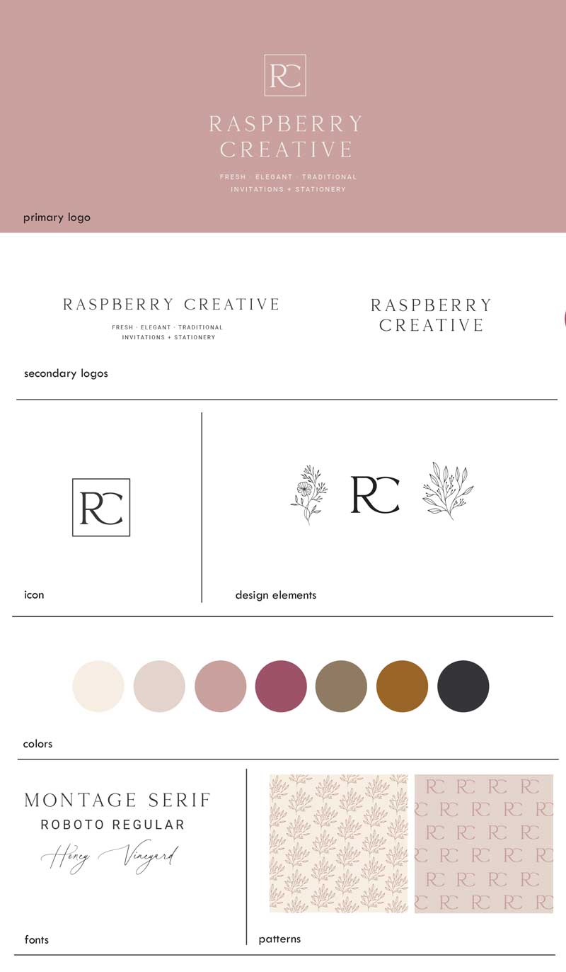
Not much else has changed in terms of identity. The color palette is staying the same except for adding in a rusty gold color and I’ve modified the fonts for a slightly more custom look.
The goal here was to create the look of an established brand that’s both professional but friendly and approachable. Grown up and timeless, but still fresh.
The new brand board is set and I’m working away on updating collateral pieces to coordinate that I’m hoping to have finished soon. The website has been updated with the new colors and logo and now we are slowly updating pages to reflect even more change that is to come.
There’s definitely more to this story but hopefully this gives you an introduction into the new look and why it’s happened now! I can’t wait to share more with you in the coming weeks!
Customer Service: M-F 9-5 EST
Closed weekends & holidays
We are not currently scheduling
in-person appointments.
Hours
Customer Service – Monday -Friday 9AM – 5PM – Online Only
We are no longer accepting in-person appointments.