Spring is one of the most beloved seasons for weddings, and for good reason. The light is softer, flowers feel effortless, and there’s a natural sense of renewal in the air. When it comes to choosing a spring wedding color palette, though, many couples worry about leaning too far into trends that may not age well.
If you’re planning a spring wedding and want your stationery, décor, and overall design to feel timeless, elegant, and enduring, the key is choosing colors that feel soft, balanced, and rooted in nature, rather than bold or overly seasonal.
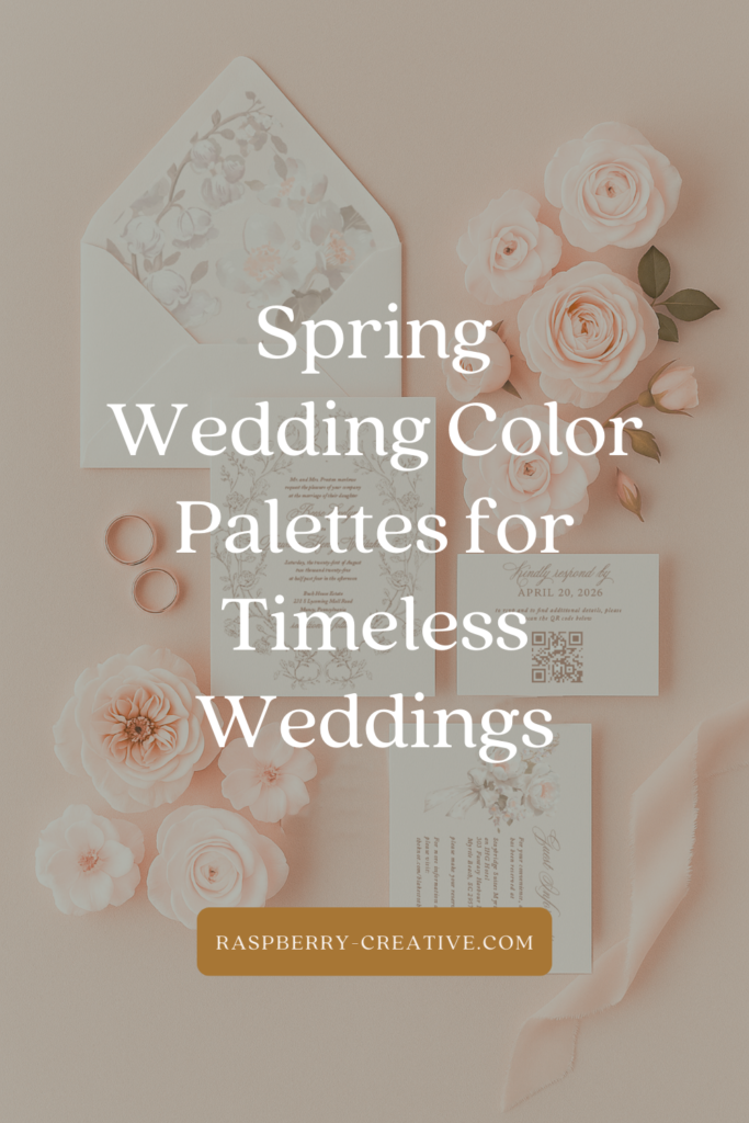
Below are my favorite spring wedding color palettes for timeless weddings, inspired by classic design, real couples, and palettes that still feel beautiful years down the road.
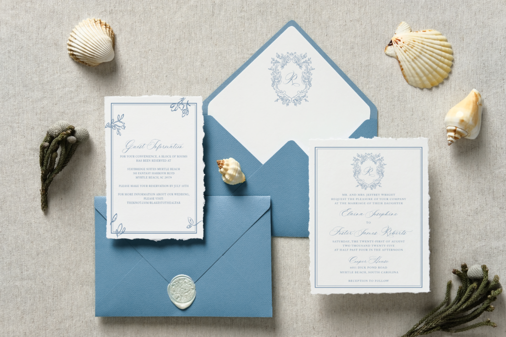
Soft Blue & Ivory
Palette:
Soft powder blue · ivory · warm white · subtle greenery
Blue has long been a staple in spring weddings, but the most timeless versions lean soft and understated, not bold or saturated. Paired with ivory instead of stark white, this palette feels calm, romantic, and endlessly elegant.
Why it lasts:
- Blue is neutral enough to transcend trends
- Works beautifully with classic typography
- Photographs softly in all lighting
Perfect for:
Estate weddings, traditional ceremonies, garden venues, and couples drawn to classic style.
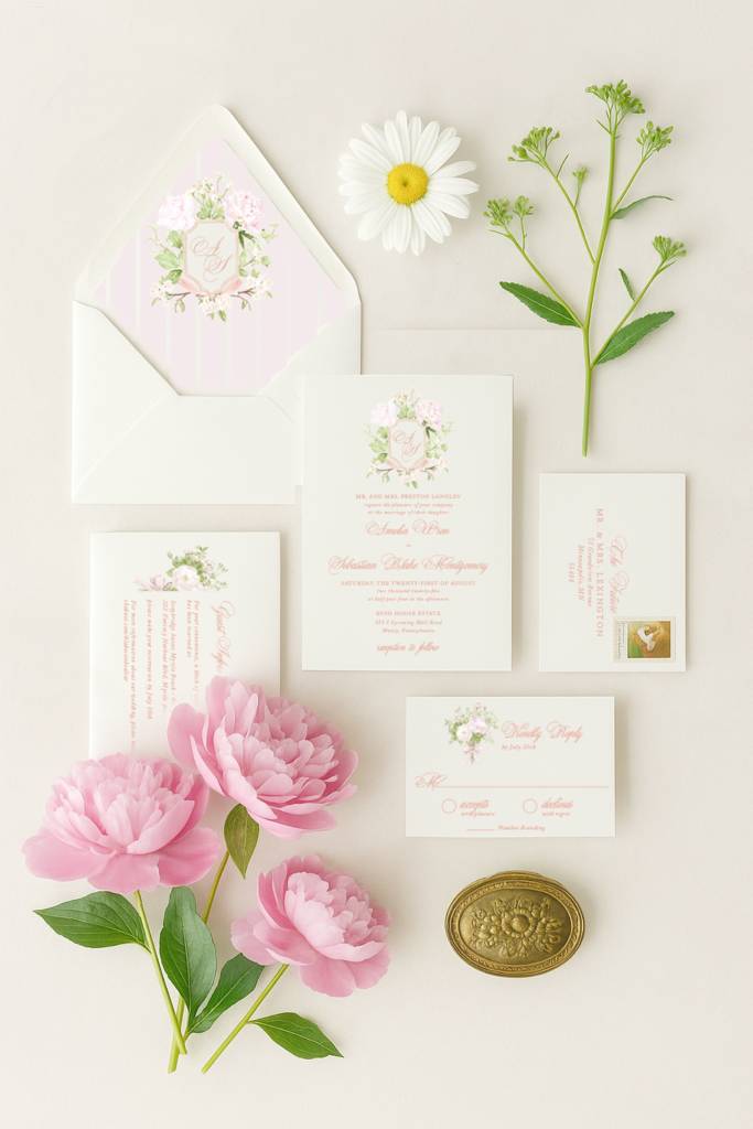
Blush, Cream & Soft Green
Palette:
Blush · cream · soft sage · muted eucalyptus
Blush has earned its place as a classic — when used thoughtfully. The key to keeping it timeless is pairing it with creamy neutrals and natural greens rather than overly pink tones.
Why it lasts:
- Soft, flattering, and gentle
- Works across décor, florals, and stationery
- Feels romantic without being overly trendy
Perfect for:
Garden weddings, outdoor spring ceremonies, and couples wanting warmth and softness.
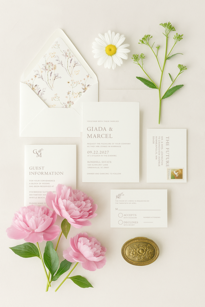
Neutral Spring Garden
Palette:
Ivory · warm taupe · soft green · hints of stone
Neutral palettes are becoming increasingly popular — and for timeless weddings, they’re hard to beat. This spring version leans light and organic rather than stark or modern.
Why it lasts:
- Not tied to any specific year or trend
- Allows texture and paper quality to shine
- Feels peaceful and refined
Perfect for:
Minimalist couples, outdoor venues, estate weddings, and stationery with beautiful typography.
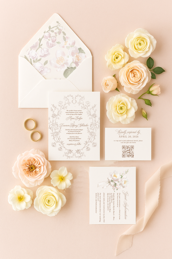
Soft Yellow, Cream & Green
Palette:
Butter yellow · cream · soft green · warm white
Yellow can feel intimidating, but soft, buttery tones paired with neutrals create a palette that feels light, cheerful, and classic — not loud or trendy.
Why it lasts:
- Feels fresh without being overpowering
- Works beautifully with spring florals
- Adds warmth while remaining elegant
Perfect for:
Spring garden weddings, daytime ceremonies, and couples wanting a subtle hint of color.
How to Choose a Timeless Spring Palette
If you’re torn between palettes, ask yourself:
- Will this still feel beautiful in photos years from now?
- Does it complement our venue and season naturally?
- Does it feel calm rather than trendy?
Your wedding stationery is often the first place your color palette comes to life, and choosing timeless colors early helps everything else fall into place more effortlessly.
Final Thoughts
Timeless spring wedding color palettes don’t shout, they whisper. They rely on balance, softness, and thoughtful pairings rather than bold statements. Whether you lean classic, romantic, floral, or neutral, choosing colors that feel grounded and natural will always serve you well.
If you’re planning a spring wedding and need help selecting stationery that reflects your palette beautifully, choosing designs that prioritize longevity and elegance is always a wonderful place to begin.

Leave a Reply